Tuesday, 7 September 2010
I'VE MOVED!
Monday, 5 April 2010
Dude
Updates....
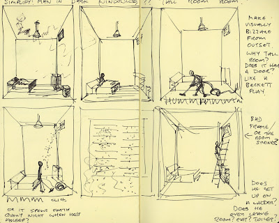

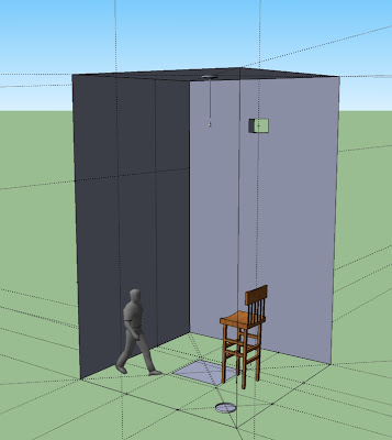 Finally, here's a post about my major project!
 Wednesday, 17 March 2010
Barely noticeable
Wednesday, 3 March 2010
Playing catch up...
Firstly, the competition:
Little White Lies, an independent movie magazine, ran a contest to see who could come up with the best one page comic book adaptation of their own favourite movie. Contestants had to squeeze the whole story of their chosen flick into a strict 6 frame template provided by the mag. I chose Ferris Bueller’s Day Off, (a) because the story’s pretty simple and I didn’t have much time and (b), because it’s f**kin’ awesome. Here is my less than adequate result:

The main thing I learnt from this is that I need to give more time to competition entries if I want to be taken seriously. Time constraints (I gave myself one evening!) meant that I pretty much went with my first idea, even though I played the film to death whilst producing the final piece. I also didn’t spend any time designing/adapting the characters (for example look at Ferris’s rubbish head or, worse still, his lady’s hair! Funny - Cameron, who is my favourite character, came out quite well though!). And I spent virtually zero time working out the compositions for each panel (No.3 is especially bad – what the hell are they meant to be doing there? I know they’re in an art gallery in downtown Chicago but anyone new to the movie would be totally stumped! I should have at least made Ferris look at a sculpture that’s in shot and not just stare at something ‘off camera’!) To top it all, I didn’t bother to scale the template up and then reduce again for the final artwork (which is a vital rule for chrissakes!). Thus it was hard to cram a lot of detail into those tiny frames and the fat lines from my brush pen look clumsy rather than dynamic.
Finally, to add insult to injury, I found out later that the mighty John Romita Jr was on the panel of judges – oh f**k it.
Anywayz, moving swiftly on…..
The Zine Fair:
For the last couple of years (as far as I know) a bunch of people called Brighton Zinefest have held an annual zine fair weekend in - you guessed it - Brighton.
Well, a few classmates and I decided to get proactive and help out at one of the stalls this year, with the hope that we might get the chance to sell some of our own stuff too.
The day was pretty fun but unfortunately I sold bugger all. Not that I was there to make money, I just wanted to get some exposure, introduce people to my work etc. I made and brought along this to sell:
...a collection of all my older short comic strips quickly edited together with Indesign and cheaply photocopied in black and white at work. The title, ‘Behold Winged Serpents’, was a joke idea for a band name/project I’d been bouncing around in my head for quite some time. The cover image is a doodle taken from one of the strips inside. I agreed to price it at £2.50. I now realise that all these things contributed to it being unsuccessful.
The title - means nothing to anyone but me. Coupled with the doodle image it creates a totally indecipherable package. Who's gonna pick up something thats self published when the cover gives absolutely no clue as to what its about? No way in? Nothing to feel affinity with? Is it a bad 'in joke'? Something about role playing games/metal bands? Eurgh. I certainly wouldn't trust it.
The price - far, far, far too expensive for something made on a photocopier! These people were browsing! They wanted cheap stuff! Quid or less, free if possible!
And finally, the content - all old strips, badly photocopied. I just wasn't proud of it. Perhaps only Dead Cells. There were no running themes, nothing. When it came to visiting other stalls with the aim of swapping, promoting and networking (which is what all my peers were doing) I just didn't have the nerve. Who the hell would want to swap their pride and joy for this hunk of sh*t? I had no confidence in what I'd made and as a result I wasn't prepared to talk to anyone about my work.
So for the next opportunity like this I'm gonna think about all these things before I go anywhere near a photocopier. The fair taught me some great lessons about choosing and appealing to your audience, the zine scene in general and what to do in order to feel confident about your work/self at these sort of events. So Behold Winged Serpents issue 2 won't probably be called Behold Winged Serpents. Im gonna keep it simple (the age old rule that seems to apply to just about everything), maybe just one strip or theme. In fact, I'm gonna make it about my experiences at the bloody zine fair - hopefully something everyone at the next one can relate to! There were plenty of funny moments (all written down, don't worry!) that would translate well into a strip. I'll post it up here as and when its made.
Ok, thats enough for this post. I'll report on the impromptu exhibition and my major project developments in the next one...
Tuesday, 26 January 2010
Keeping 'em coming....
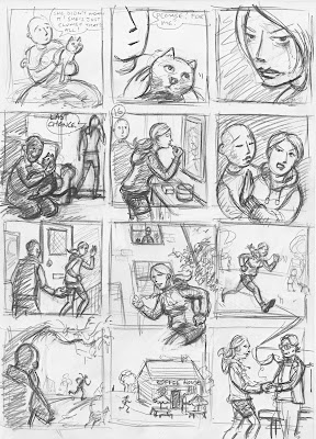

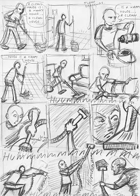
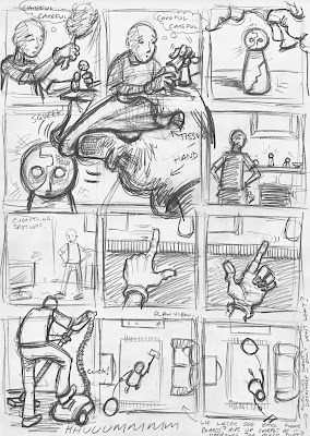 Here are my next lot of 'boards, written as they would happen chronologically. Although there's a gap here between the second and third page cos I ain't written it yet (the missing bit being the answer to the narrative's puzzle). I was just desperate to start drawing the protagonist in his living hell to see how it would look!
Monday, 18 January 2010
Trouble in paradise
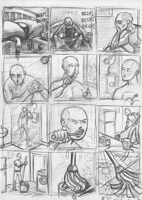
Here are some storyboards I have been working on. They've been written in chronological order but this is not necessarily the order they will appear in within the story. Instead, the narrative will start in the present tense and flashback to these scenes as the plot unravels...you with me?
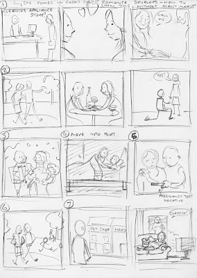
The current day will depict the man you see here alone in his flat going through a daily hygiene and housecleaning ritual which will get more and more ridiculous by the minute. He showers and brushes his teeth endlessly, dusts and vacuums the flat again and again, never leaving his apartment for fear of the dirty world outside which he has no control over.
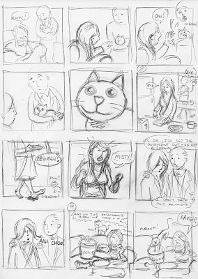 When the story then goes back in time we will realise that events in the past have caused these obsessions and we start to wonder what else could have happened. Why is the man now alone? What has happened to his wife and the pet cat she hated?
 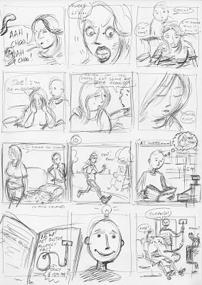 The flashbacks reveal a once blissful relationship in turmoil. We see the wife's descent into depression, her extreme hatred of the animal pushed further on by the allergy its brought out in her. The husband does everything in his power to make things okay but they seem to go from bad to worse.
 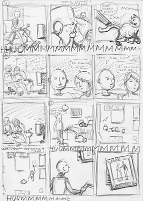 He then notices the vent hidden by their wedding photo in the bedroom. This vent will have great significance in the present day. It will be symbolic of some piece of the puzzle which is out of the protagonist's control. In the present it constantly spews forth dust and muck which he finds impossible to clean. Why is this? What does the vent represent? Guilt over something he has done wrong? I don't actually yet know...
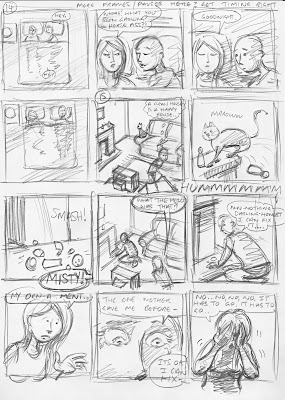 ...that's not to say I haven't had ideas. They just haven't yet been quite right. You can probably guess. I did say I wanted this story to be dark.


